A calendar view is probably the most important and easy to understand in all applications that use events. It has to show the right information with not very many clicks so that when your customers call or go to your application, they can instantly see if they can attend that event. We did OK in alpha-2, but were still unhappy with several elements.
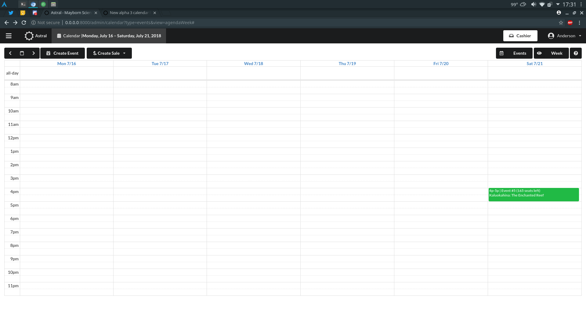

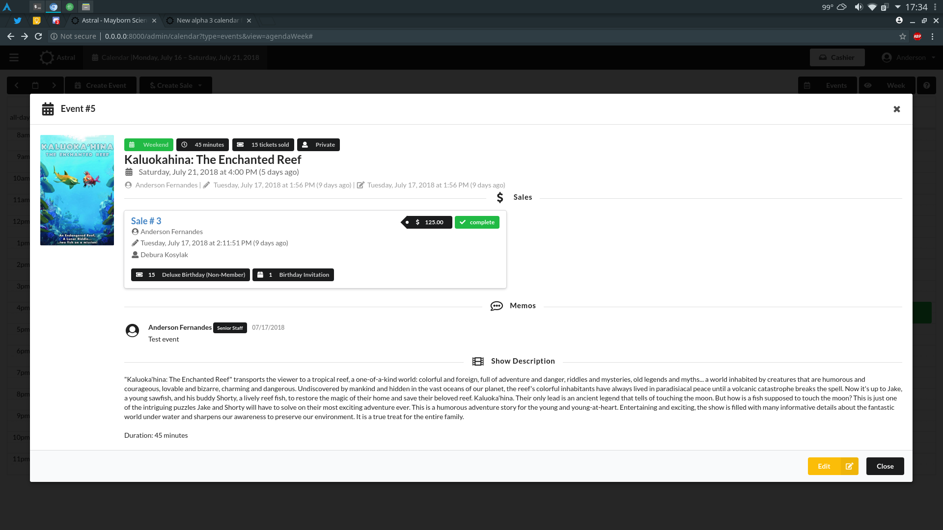
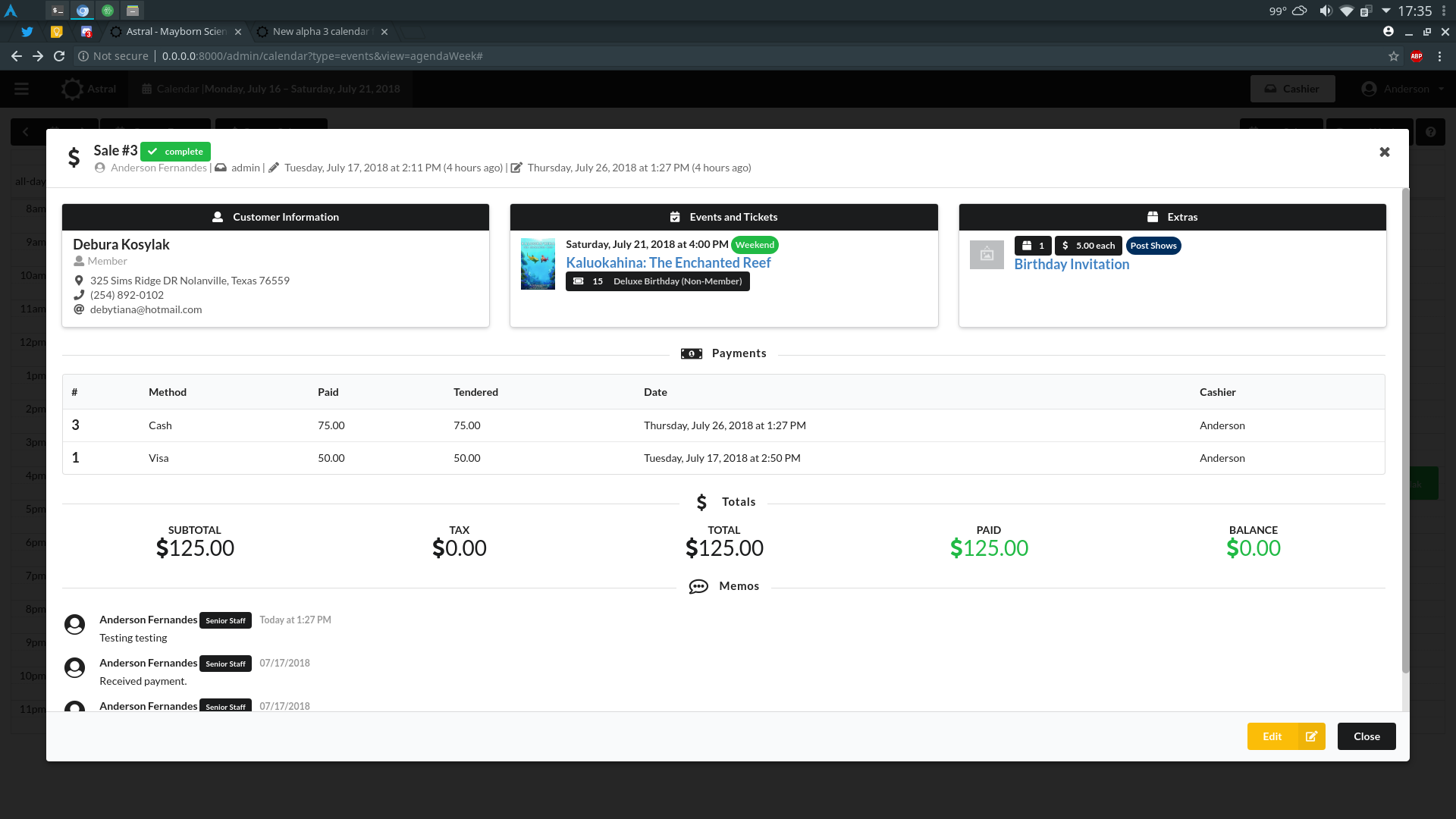
Astral’s Calendar now, besides having events and sales merged, only shows details on the item you want to see: if you are in the events view, when you click on an event you will see the data of that event, with an UI completely revamped. when you click on a sale while on the sales event, you will see information on that sale. This is a huge improvement that will help differentiate and remove the confusion (you’re welcome, Cliff).
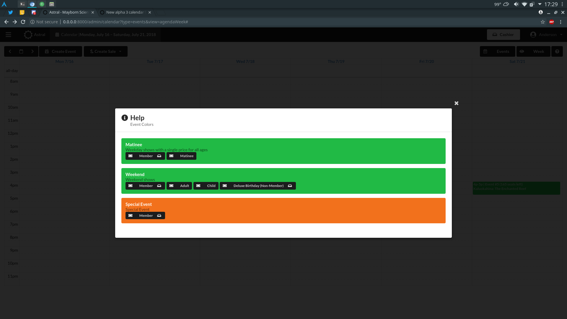
If your organization has many events types, at the end of the day, the top part of your Calendar would be filled with information on the color code for each event type. We have cleaned that up by putting that information on a pop up of its own, with even more information on each event type, like what kind of tickets are allowed, what are the prices of those tickets, if they are available in cashier, etc.
Pretty cool, right? But that is not all. What if you wanted to schedule something for your staff, like a meeting? What if you want to “mark someone as out of the office” by creating an all day event and putting that up there? Now you can!
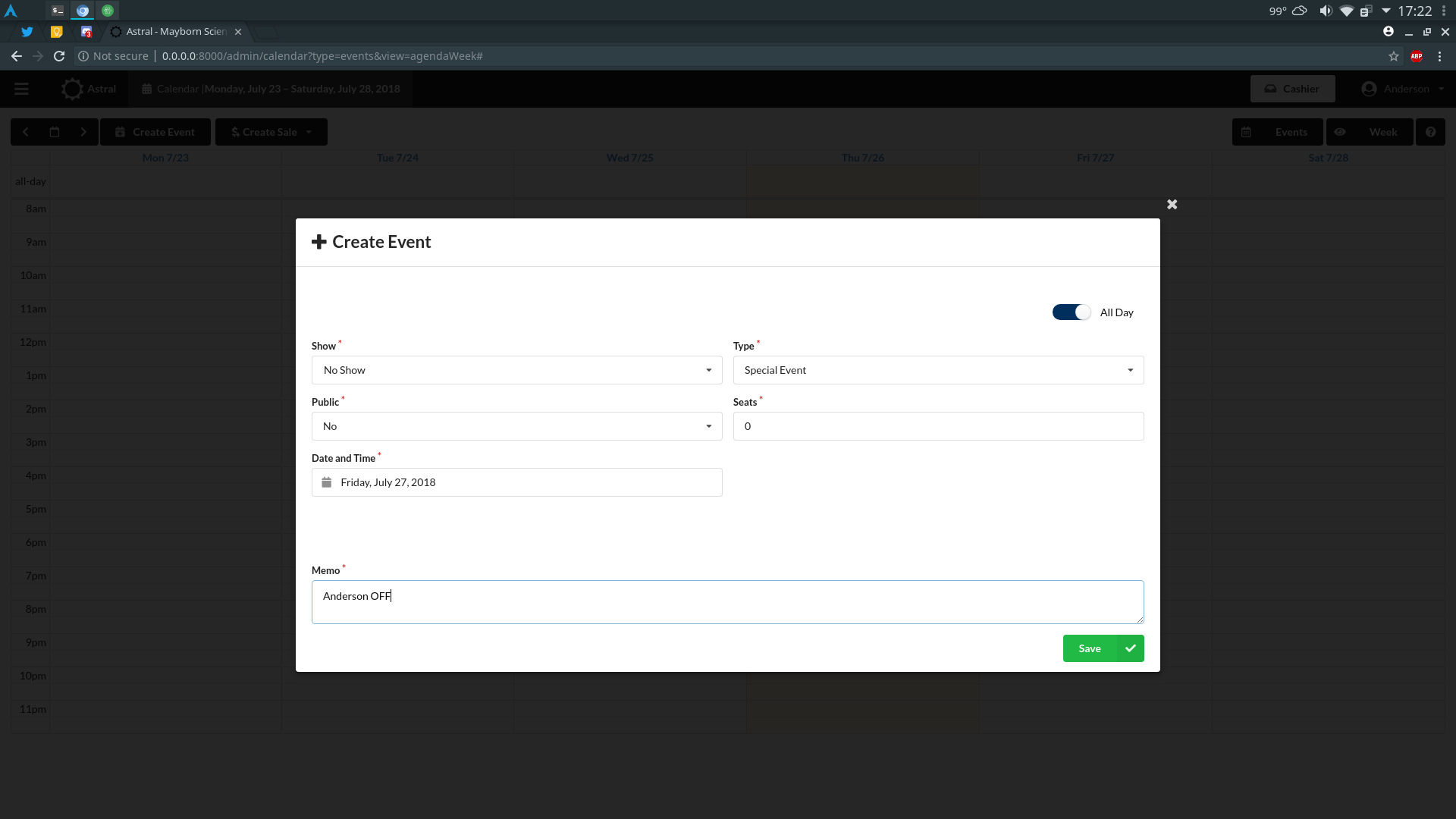
In addition to that, we’ve also made mandatory the memo field when people create events because people were creating them left and right and forget what they were originally created for.
Naturally, these changes are also reflected in the mini-calendar present in the admin dashboard. But that is a subject for a different post.